What happens when a demo page explains the product beautifully and still books almost nothing? Feature grid, product tour, three testimonials, a careers link in the footer. Traffic shows up. Sales still waits.
Curiosity without a booking path is theater. Homepages browse. Demo pages decide.
This is for operators running paid search, Meta, or outbound who need a page shape that books demos or strategy calls without forcing buyers through a product museum. Homepages browse. Demo pages decide.
Lead with the offer and the next step
Above the fold: who it is for, what they get, and a single primary CTA. State the audience cue early, role, company context, or situation, so the wrong visitors self-select out before they waste SDR time.
The fold should answer three questions in plain language:
- Is this for me?
- What happens if I click?
- How do I start?
If the first screen needs a scroll to find the ask, you are asking paid and outbound traffic to work for clarity they already paid for with their click. Message match still governs the top: the fold must continue the ad or email promise. See message match.
From what I’ve seen, teams spend weeks polishing mid-page blocks while the fold still brands hard and offers soft. Fix the fold first. Everything below it inherits that decision.
Earn the scroll with process and proof
Useful mid-page blocks, in an order that usually holds up:
- Problem framing in the buyer’s language, not internal jargon
- How it works in three clear steps
- Proof that does not invent ROI (logos, methodology, screenshots)
- Objections answered briefly (timeline, fit, what happens after submit)
Problem → process → proof → CTA beats feature dumps. Keep each block doing one job. If a section does not reduce doubt or advance the booking, cut it.
Write process steps as outcomes (“we map your click-to-CRM loop”), not activity theater (“we leverage synergies”). Buyers book clarity. I’ve watched well-written slogans lose to a dull three-step process more often than the reverse.
Put evidence near the CTA, after the offer claim, and wherever you ask for time on a calendar. Warehouse logos in a footer nobody reaches and you wasted the asset. Specificity beats adjectives. Expand in proof without fake case studies.
Objection blocks should sound like sales answers, not FAQ filler. Timeline, who joins the call, what preparation is needed, and who the offer is not for. Those reduce no-shows and junk submits better than another adjective.
Keep the form close to the decision
Repeat the CTA after proof. Do not bury the calendar or form under unrelated product tours. High-intent Google Ads traffic especially resents a scavenger hunt.
Qualification fields belong when sales needs them: company size, use case, timeline, or enrich immediately after capture. A bare email field trains volume. A wall of fields on step one punishes intent. Balance in form fields: fewer vs smarter.
If you need progressive disclosure, a short multi-step path can help, but only after the offer is clear. Compare shapes in multi-step vs single-page. Calendar embeds should load fast and look like part of the page, not a surprise iframe after a guilt trip.
Remove nav that restarts the buying journey. Header logos that deep-link into the full site are a common leak. Footer links to careers and login belong elsewhere. One primary CTA style matters too. Mixing “download the guide,” “watch the video,” and “book a demo” as equal peers teaches indecision.
Shared pages across channels work when the conversation is the same. If cold email promises a teardown and Meta sells a webinar, split. Guidance on shared destinations: landing pages for paid and outbound.
Mobile, speed, and what earns a place
Test the fold on a phone. Outbound and Meta Ads traffic often arrive there. Heavy heroes that delay the CTA tax every channel. Page speed is a conversion feature. So is readable type, thumb-reachable CTAs, and forms that do not fight autofill. Fancy motion that blocks the ask is decoration, not structure.
Instrument the primary submit or booking event, and keep soft clicks diagnostic only. See what to track.
Every section must either qualify the visitor, reduce a specific doubt, or advance the booking. If it only “tells our story,” it belongs on About, not on a demo destination that paid for the click. Be ruthless with product tours: one focused walkthrough tied to the offer beats a museum of features.
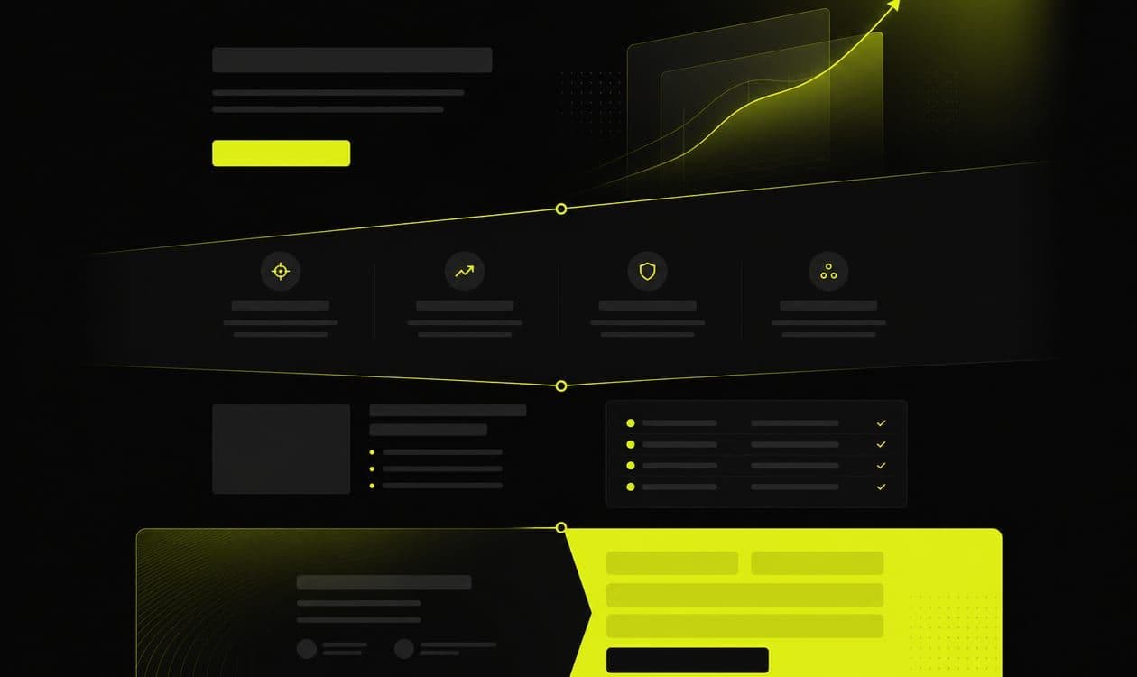
A default stack that has held up for us:
- Fold: audience + offer + primary CTA
- Problem: buyer language
- Process: three steps to the conversation
- Proof: artifact near doubt
- Objections: short, sales-true answers
- CTA repeat: form or calendar
When stakeholders demand more sections, trade explicitly. Adding a feature grid means cutting something else or accepting a longer path to the CTA. Structure is a budget. Spend it on outcomes, not completeness.
Operate the page after launch
Structure is not a one-time design sprint. Weekly: check whether sales conversations start where the page left off. Biweekly: test one block, headline, proof unit, or form friction, not a full redesign. Monthly: review opportunity rate by source against the page version live at the time.
Common failure modes I keep seeing:
- Hero that brands hard and offers soft
- Mid-page feature grid with no CTA return
- Testimonials that could belong to any vendor
- Calendar embed buried below a second product tour
Fix the structure before you blame creative fatigue or bid strategy. A clear page makes media measurable. A messy page makes every channel look broken.
One messy observation: heatmaps sometimes show people hammering a mid-page CTA while ignoring a polished fold button that looks “more on brand.” I’m still unsure whether that is trust, scroll habit, or offer fatigue. Worth noticing before you redesign the hero again.
Keep a changelog of page versions so you can attribute pipeline shifts to offer and layout, not vibes. After launch, annotate heatmaps and sales notes against sections. If nobody reaches the third proof block, move proof up or cut length. If people hammer the fold CTA and still bounce, the offer or match is wrong, not the footer.
We build B2B landing pages and funnels as conversion infrastructure for demos and strategy calls. Book a free strategy call if your page explains everything and books nothing. Bring the live URL and what sales hears on the first five minutes of calls.