Rebuilding a demo destination into a five-step quiz because a competitor used one can look smart in the funnel report. Step-one completion climbs. Qualified meetings fall. High-intent Search traffic ends up clicking through screens to earn a calendar they already wanted.
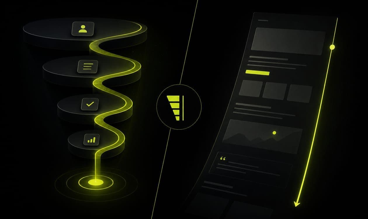
Multi-step funnels are not automatically more modern. Single-page LPs are not automatically too simple. Pick the shape that matches offer complexity and sales capacity.
This comparison is for B2B operators converting paid and outbound traffic into qualified conversations, without adding screens for fashion.
Prefer a single page when intent is high
Search traffic with a clear offer, a short form, and a booking CTA usually wins on a focused page. Extra steps add drop-off without adding clarity. If the buyer already typed a problem into Google, do not make them click through a quiz to earn a calendar.
Single-page fits when:
- The offer is one obvious next step (demo, teardown, strategy call)
- Sales can handle light qualification on the call or via enrichment
- Google Ads themes are tight and message-matched
Keep the anatomy sharp: offer, process, proof, CTA. See structure that books demos. High intent is a gift. Do not tax it with unnecessary interaction design.
From what I’ve seen, the teams that regret multi-step most are the ones who added it on Search first, where the buyer had already done the qualification in the query box.
Prefer multi-step when you must qualify or educate
Use steps when buyers need a short diagnostic, self-segmentation, or progressive disclosure before they earn a sales conversation. Each step should have one job, not a mini-website.
Multi-step earns its keep when:
- Sales capacity is tight and junk meetings are expensive
- Offer fit depends on use case, stack, or company context
- You need to route different segments to different calendars or owners
- Meta or colder traffic needs a guided path before a hard ask
Progressive fields beat a twelve-field wall on screen one. Pair with fewer vs smarter form fields. Name each step’s job in the brief before design starts. If you cannot name it, delete the step.
Do not use multi-step to collect vanity demographics you will never route on. Every question should change ownership, talk track, or eligibility. Otherwise you bought drop-off for theater.
Do not use steps to hide a weak offer
If the first screen is vague, step two will not save it. Fix message match and offer clarity before you add screens. Funnel cosmetics on a broken promise still produce confused pipeline.
Also avoid steps that restart branding from zero on every screen. Continuity across steps is message match applied horizontally. The buyer should feel one conversation progressing, not a new microsite per click.
I’m still unsure how often “we need a quiz” is really “we don’t trust our ICP.” Funnel software will not invent judgment you have not defined. High junk cost plus fuzzy disqualifiers means fix ICP and offer before you build either shape.
Measure the whole path, then pair by channel
Compare cost per qualified conversation across shapes, not just step-one completion rate. A funnel that “converts” into junk is still a failure. Track step drop-offs as diagnostics. Optimize to meetings and opportunities. Event hierarchy: what to track on a lead-gen landing page.
If you run both shapes for different channels, keep definitions identical. Otherwise you will declare a winner based on apples-to-oranges CPL. Document the live version of each path so pipeline reviews can attribute quality to shape, not folklore.
Channel pairing that usually holds up:
- High-intent Search → lean single page with matched headline and booking CTA
- Meta Ads with colder awareness → short path that educates then asks, or Instant Forms when speed matters (knowing the quality tradeoffs)
- Cold email → usually a single decisive page that continues the email promise. Multi-step only if the reply ask was a diagnostic sequence
Shared destinations across paid and outbound still need one job. See landing pages for paid and outbound. Do not run three different funnel philosophies into one SDR queue without labeling expectations. Keep proof honest on either shape. See proof without fake case studies.
Habits, switches, and a one-meeting decision
Implementation habits that keep funnels honest:
- Cap steps. Every extra screen needs a qualification reason
- Put proof where commitment rises (near the final ask)
- Route by answers instead of collecting vanity demographics
- QA mobile. Multi-step pain compounds on small screens
- Isolate shape tests from creative and audience changes
Do not A/B “funnel vs page” while changing offer, creative, and audience at once. Isolate the shape or you will learn nothing. Speed still matters: a slow step two feels like abandonment even when the offer is strong.
Move from single page to multi-step when sales rejects volume despite message match and sane fields, and you can define disqualifiers the funnel can ask cleanly. Move from multi-step to single page when drop-off is brutal, intent is clearly high, and SDRs can qualify faster than the quiz. Complexity is not a badge.
Revisit quarterly. Sales capacity, ICP tightness, and channel mix change. The shape that worked for cold Meta last quarter may be wrong for high-intent Search this quarter.
One messy observation: I’ve watched a stakeholder-protected “just one more step” slowly turn a winning single page into a three-step funnel nobody admitted building. Feature creep does the same damage as a deliberate redesign. Kill losing steps quickly. Protect winning single pages from quiet lengthening.
Bring offer, ICP, channel mix, and sales capacity into one room. Score the motion on intent clarity of the traffic, cost of a junk meeting, and whether disqualifiers can be asked cleanly without sounding like a census. Write the decision down with a review date and a success metric: cost per qualified conversation across the whole path.
Prototype copy before pixels. A text outline of each step’s job exposes fluff faster than a polished interactive mock. If step two is “more about us,” you are designing a brochure with friction, not a qualification path. If stakeholders want more steps because competitors use quizzes, ask which disqualifier each step will capture.
We design B2B landing pages and funnels to match channel intent and sales reality. Book a free strategy call if you are debating steps versus a single page. Bring offer, ICP, and how many junk meetings you can afford this month.